
Elliephant Two-Page Spread
Description:
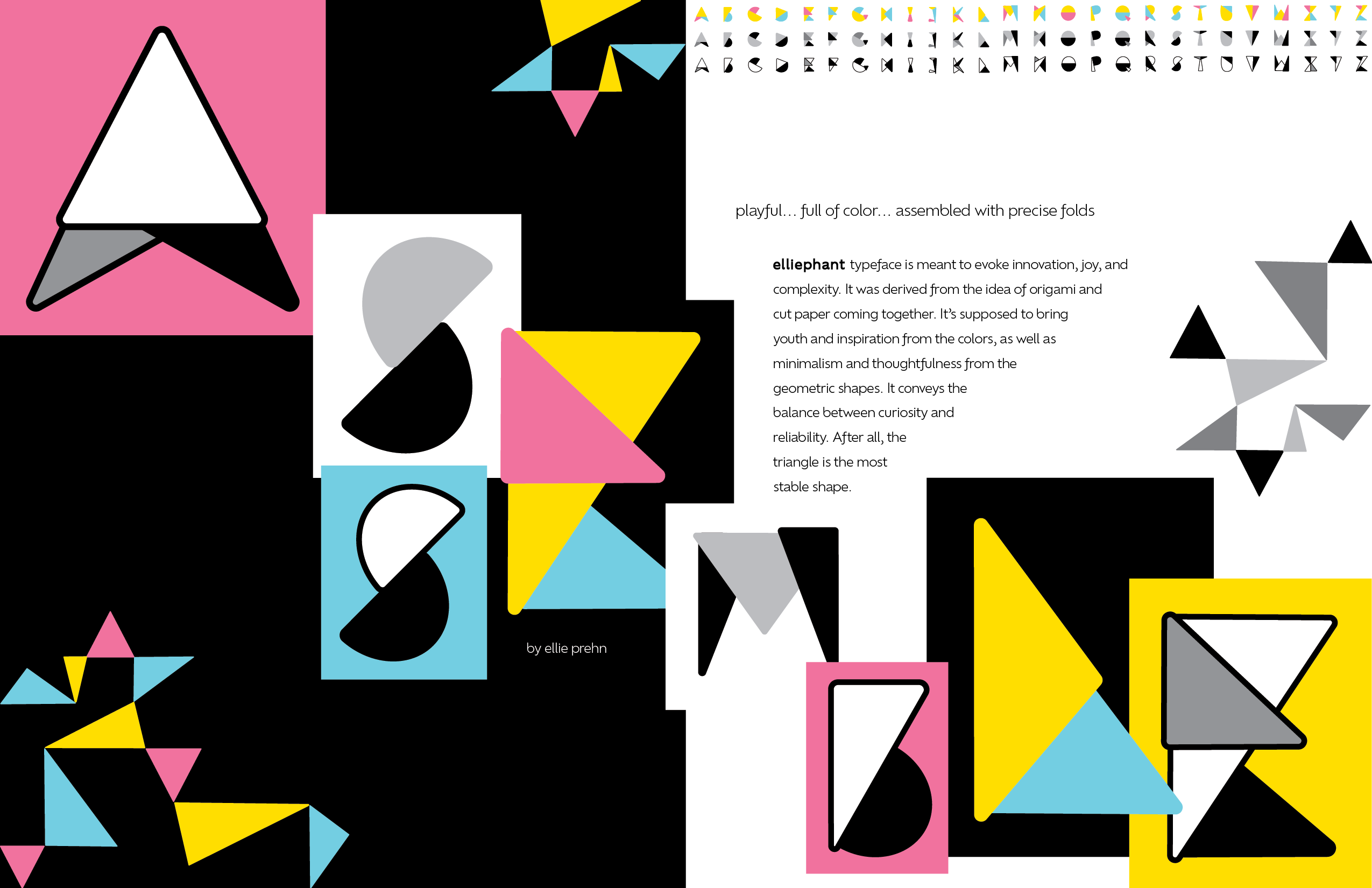
To supplement our create-your-own-typeface project, we were instructed to design a two-page spread that exhibited our typeface. The only requirement was that we had to show a full typeface specimen somewhere on the spread
Process:
The biggest challenge I faced in this project was experimenting with composition and how the viewer’s eye would flow across both pages. At the beginning, I thought I wanted to do some sort of grid showing different characters from each version of the typeface, but then I realized that might be too static. Then, I had the idea to have a diagonal composition with something thrown across the middle of both pages to allow the viewer’s eye to wander in a more fixed path. The word I decided on as the subject became ‘assemble,’ which both had to do with the characters being assembled into words and the characters recalling origami.
Outcome:
Although I like the overall composition of this spread, I think to refine this project I would include less white space and more characters from my typeface. It would be interesting to play with a spread that is more collage-like and messier. However, this project was valuable in introducing me to the importance of layout in things like advertisements and publications.